Learn intermediate skills in Power BI
This course will help you navigate the different tools available through Power BI. We will learn how to create custom visualizations, share and publish reports, and more.

Chapter 1: Advanced Visualizations
Want to learn how to create extra visualizations that will make your data presentation more appealing and professional? In Chapter 1 you will learn how to make visualizations showing profits and locations.
20 min.
Chapter 2 : Data Shaping
Want to learn how to transform data in Power BI and change data types? Chapter 2 will help you understand the techniques of transforming data, changing data types, combining data, replacing values and sorting tables, rows and columns.
30 min.
Grant Thornton
Expert
Grant Thornton CZ has years of experience with Power BI. Our firm has worked with many clients, such as PRE, Nakit, and Mondi, to implement Power BI into their workflow. The result from using this solution has been transformative, streamlining processes and unifying enterprise data into a visually immersive central hub.
Chapter 3 : Formatting Visualizations & Customizing
Want to learn how to portray your data using Power BI? Read Chapter 3 to learn more about the basics of visualizations design and become proficient in creating attractive charts and diagrams.
20 min.
Chapter 4 : Creating Reference Lines and Filters Pane
Want to learn how to create dynamic reference lines and filters pane to filter your data in visualizations? In Chapter 4 you will explore the various types of reference lines and understand the basics of filtering visualizations..
20 min.
Chapter 1 : Advanced Visualizations
Card Visualization
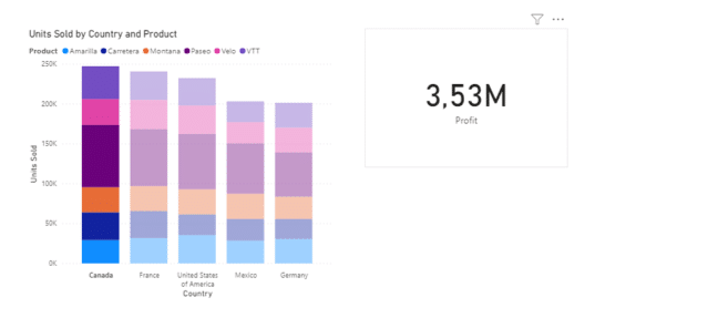
Card visualization is one of the Power BI’s most used visuals as it clearly displays total of a numerical value, such as profit. To create a card visualization, simply click on a blank space on the canvas and select a card visual. Then in the Fields Pane, select the field you want it to display. The field selected should be of numerical value, not a text.
Map Visualization
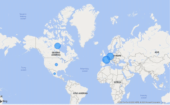
Map visualization is useful to display how a business operates in different regions or countries. When creating a Map visualization, one must select a field (for example City) as location and a field (for example profit) as size. That way, the circles forming on the map will be located accordingly and their size will be proportional to their profit, in this example.
Slicer Visualization
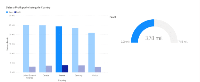
Slicer allows you to filter the other visuals, for example by location. If you select a France in your Bar Chart, your Slicer will then only display profit corresponding to the country you selected.
Tree Map Visualization
Tree Map visualization is a method of displaying hierarchical data using nested figures usually rectangles. In Power BI you can create a Tree Map Visual as shown on the screenshot below. Population size by country is shown in the example.

Map Visualization
Map visual lets you observe your data, such as profit, in a geological context. You see not only see the profit as an abstract measure, but you see exactly where that profit is made.
To create a map visual, select it and then add a Location value in the Fields pane. This might be Country, State or Province. To see the Profit in this context, simply select it in the Fields pane and drag it into the Size measure.
At times, taking only these steps might result in a confusing visual. To improve the clarity of data display, go into Settings, then Options and finally Preview features. In this window, turn on the Shape map visual feature. Your map is now more organized and clear for you and your clients.


Scatter chart (Bubble plot)
Scatter charts are useful when it comes to see possible correlations between two measures. In this particular example, we are focusing on Sales and Profit. Through the Scatter chart visual, we will be able to answer the questions; “As our sales values increase, do our profit values increase as well?”
To create a scatter chart, select the visual in the Visuals pane and then, likely, select two measurements. In this case, we will be selecting Profit (axis X) and Sales (axis Y).
To further enhance your chart, you can select a Legend (such as Product Category) to reflect Profit and Sales correlation in a specific context.


For further overview, you can add a third variable to create so-called Bubble plots. In this case, we set up Order quantity as a Size legend. This will ensure that we see the Profit/Sales correlation in the context of Order quantities.


Chapter 2 : Data Shaping
Transforming data
One of the data transformation operations you can do is changing the name of the columns and tables. In this section you will learn how to rename or delete the name of a data set.
Firstly, go to “Edit Queries” and click on “Edit Queries” to open a new window called “Query Editor.”
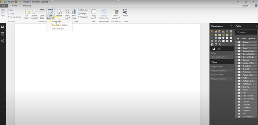
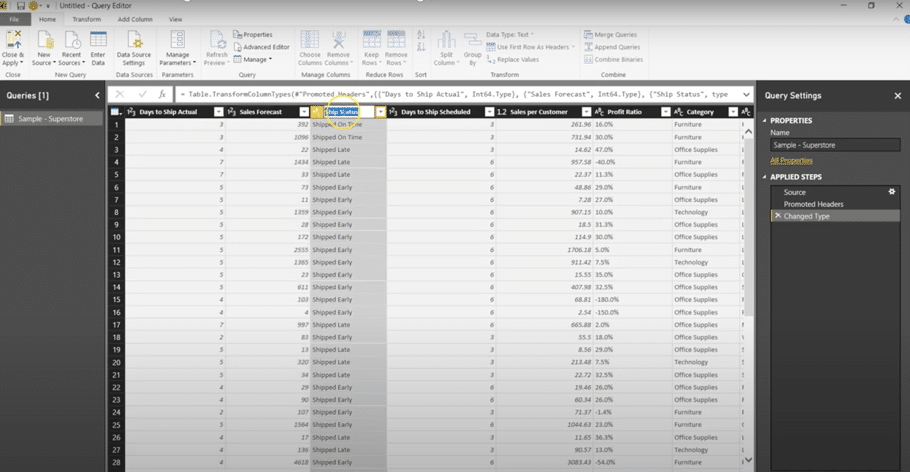
The screenshot below shows the “Query Editor” new window. To rename a column double click on the name of the column as shown on the screenshot.
The step by step edits you make will be shown on the right-hand-side bar named “applied steps.” You can review and re-do your steps using that bar if you select the step you want to delete and press the cross right next to the listed step as shown on the screenshot below.
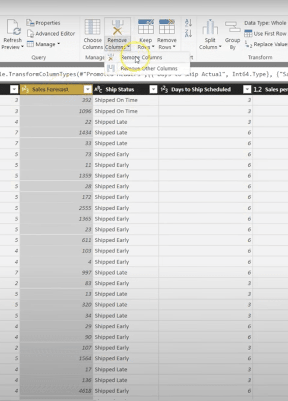
If you want to remove a column select the column you want to remove, click on “remove columns” as shown on the screenshot below. You can re-do the operation in “Applied steps.”
Changing data types
Power BI supports following data types: Decimal Number, Fixed decimal number, Whole Number, Percentage, Date/Time, Date, Time, Date/Time/Time zone, Duration, Text, True/False and Binary.
Power BI assigns each column a single data type. To change a data type, select column or columns, right-click a column header, select Change Type and choose a new data type from the menu. Alternatively, select the column and choose a new data type from the menu in the Transform Group of the Home tab.
Sorting the Table, Rows and Columns
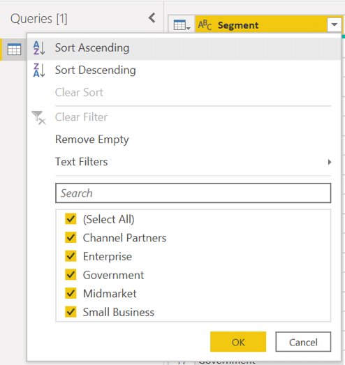
If you want, for example, sort the table according to one of the columns, click on the dropdown option of this column and choose either Sort Ascending or Sort Descending. In our case we sorted the table according to the column “Segment” in Ascending order. Notice the Step “Sorted Rows” that appeared in the Applied Steps.
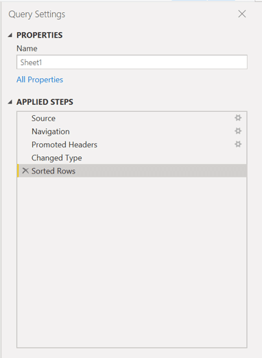
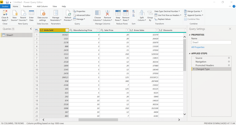
Columns can be removed using the Manage Columns Group on the Home tab. Select the columns you need to remove and click on Remove Columns. Similarly, to remove rows, firstly select column or columns from which you need to remove rows, then click on Remove Rows from Reduce Rows group on the Home tab and select from dropdown list.
To only remove the first row, click on Remove rows and then write in “1” if you only wish to remove the very first row. After the removal, you will see Removed Rows (or Removed Columns) in the Applied Steps.


Combining data
In this section you will learn how to connect two or more data sources and shaping them as needed.
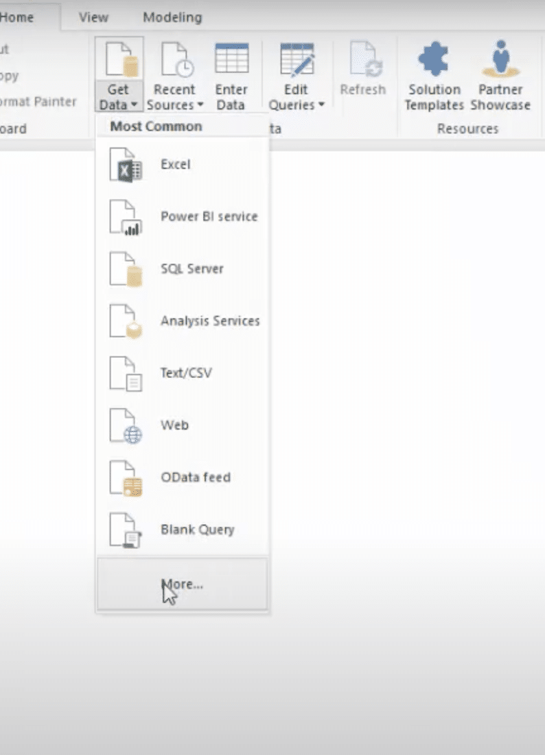
Click on the drop bar arrow “Get data” then select the correct format of the data. For example, if the data is from a Website press “Web” and if the data is in a folder click on “more” as shown on the screenshot below.
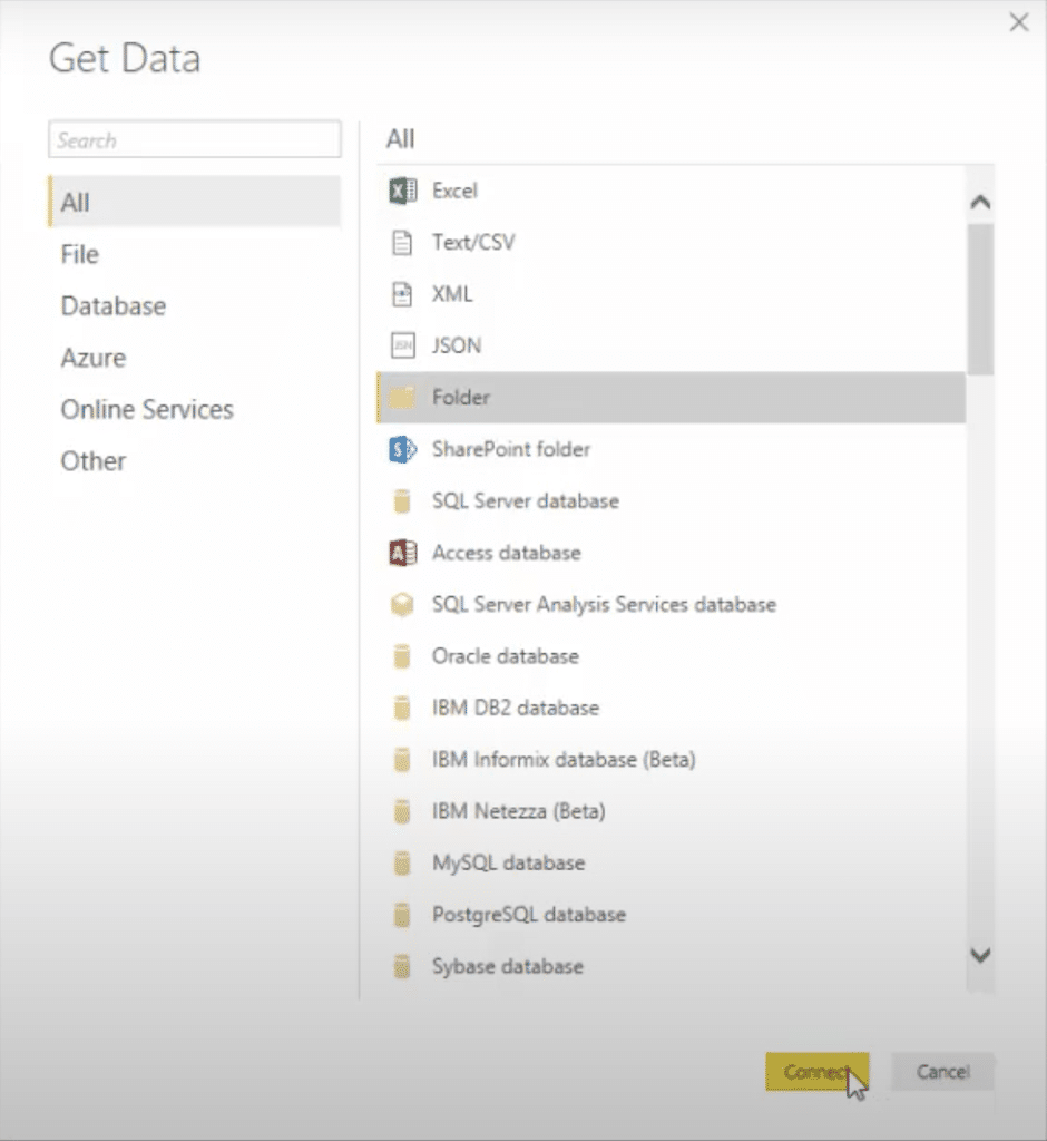
Select folder and click “connect” as shown on the screenshot below. Then find the files by typing its name or in Browse.
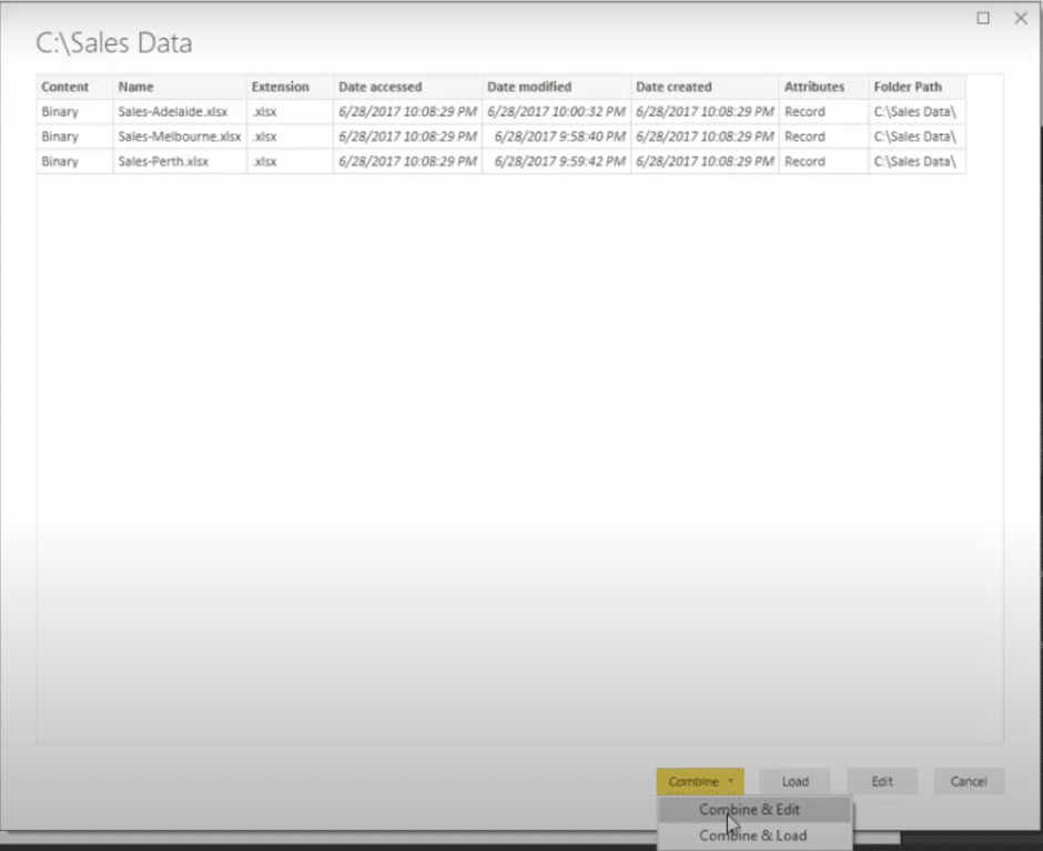
Then click on “Combine & Edit” as shown below. Then another window will open where you can check the data combination, if satisfied press “okay”
Then the Query Editor will open where you can change the name of the columns and make other format edits such as combining two columns into one. When you are done click on “Close & Apply” in the left-hand corner.
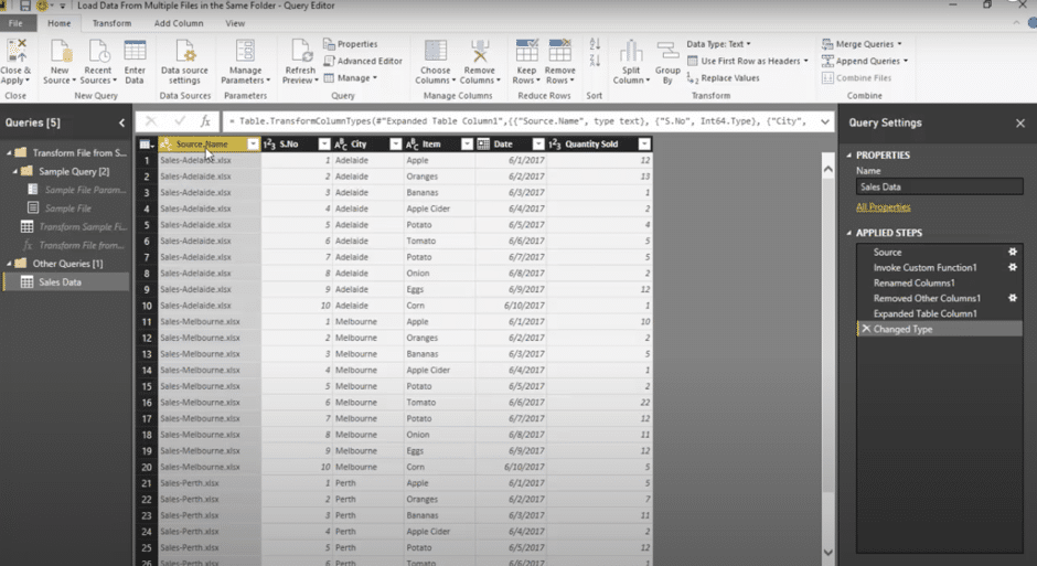
Merging and Appending Columns
There are two primary ways how to combine data – merge and append. When you have one or more columns you would like to add to another query, you merge the queries. When you have additional rows of data you would like to add to one of queries, you append the query.
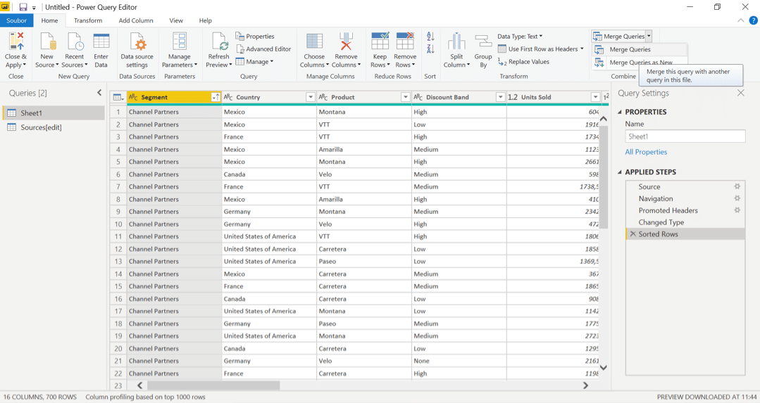
In this example, we will add information to our original query, we firstly select Sheet1, then click on Merge Queries on the “Power Query Editor” home tab as shown on the screenshot below.
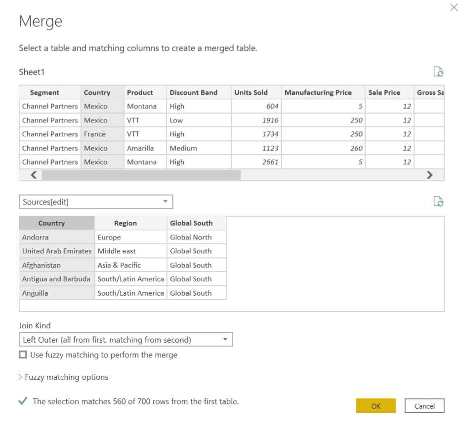
In the window that shows up, we select to merge Sheet1 with Sources[edit]. We also select column “Country” in both as the matching columns. Lastly, we choose the “Join Kind”. For our case, as we want to add information to our original table, Left Outer is the best option. See the screenshot below.
As result, there are three new rows in the Sheet1.
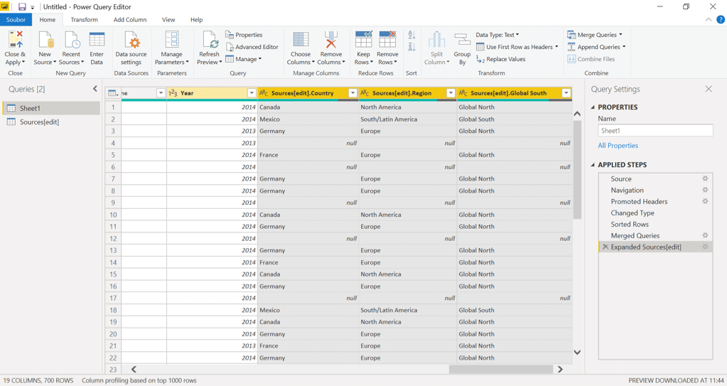
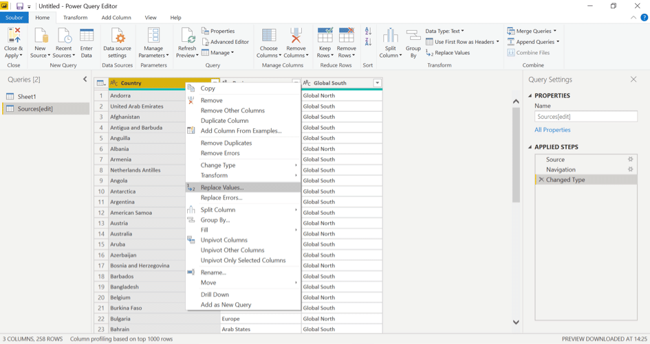
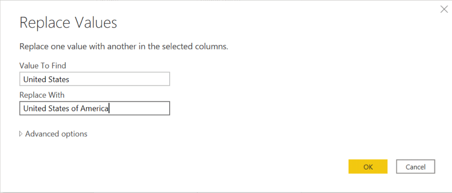
As we can see, there are three new columns attached from query Sources[edit]. As we can see there are countries in Sheet1 for which Power BI could not find equivalent in Sources[edit] with null in attached columns. This is because Sheet1 uses ‘United States of America’, whereas Sources[edit] query uses ‘United States’. We can fix this if replace all ‘United States’ values in the Sources[edit] columns with ‘United States of America’. To learn how to replace values see “Replacing Values” below.
Replacing Values
When we need to replace values from specific columns, we right click on the header of that column (or select multiple columns) and select Replace Values. In the window that shows we write down the values that should be replaced and values we want to insert instead.
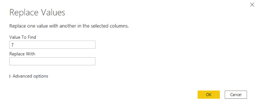
If the data contains an erroneous value, such as “?” before the numbers, remove it by clicking on Replace values and replacing it with blank.
Formatting Visualizations
Basics
You can customize your visualizations to your liking in the Visualizations Pane. When you click on it, the Pane offers three icons; Fields, Format and Analysis. If you click on the Format icon, colour and axis customizations appear.
The following elements can be customized:
- Legend
- X axis
- Y axis
- Data colours (choose your own colour in the „your colour“ section by using a HEX code)
- Data labels
- Shapes
- Plot area
- Title
- Background
- Lock aspect
- Border
- Visual headers
- Position
(Not all are customizable for each visualization type)
Customizing
Customizing the Title
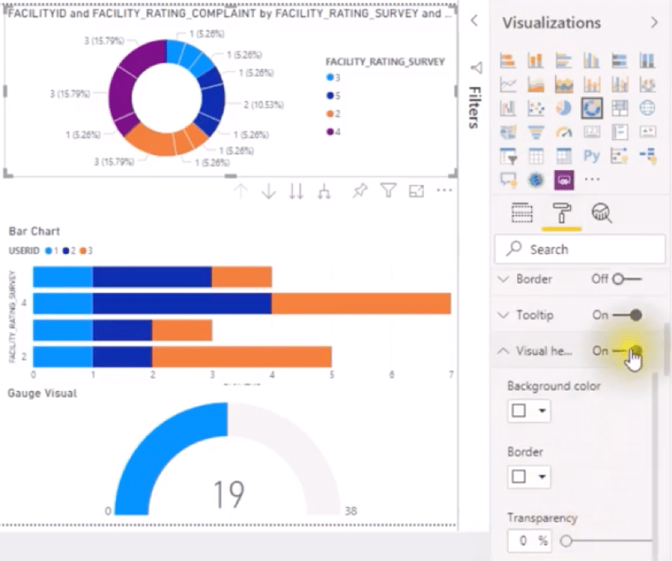
- Select the paint roller icon and formatting options appear.
- Click on “Visual Heading” and expand the section.
- Title can be turned on and off by the switch and you can change the title, select the colour, size and type of the font, as well as the colour of the background or justification as shown on the screenshot below.
Customizing the Background
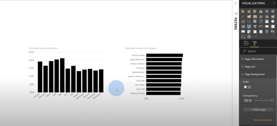
- Background is customizable in the Page background section once you click on the paint roller. It can also be switched on and off. The colour of the background can be selected, or you can define a custom colour, as shown on the screenshot below.
Customizing the Legend
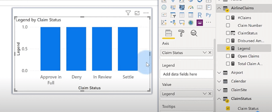
- We will choose a bar chart visualization for this example.
- Then create a constant value measure, in this example „Legend“ and drag it onto the visualization as a value.
- Then select the variable that you would like to have in your legend, in this example „Claim Status“, and drag it to „axis“ in the visualization section. See screenshot below.
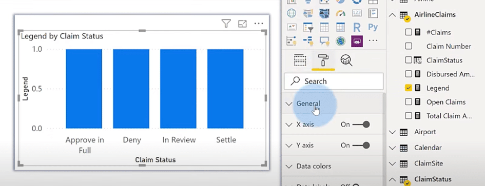
- To format the legend – for example change colour or the background go to the brush icon as shown on the screenshot below.
Creating Reference Lines and Filters Pane
Creating dynamic reference lines
Using the Analysis icon, you can create the following types of dynamic reference lines:
- Constant line on the X axis
- Constant line of the Y axis
- Minimum line
- Maximum line
- Average line
- Median line
- Percentile line
(Not all lines are available for all types of visualizations)
Filters Pane
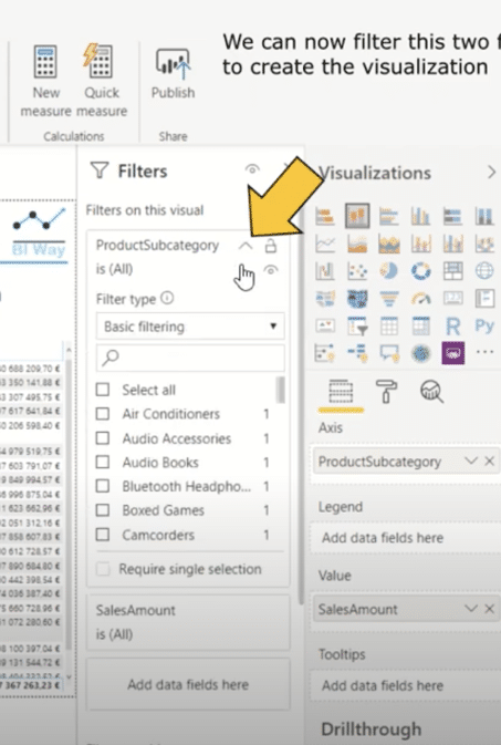
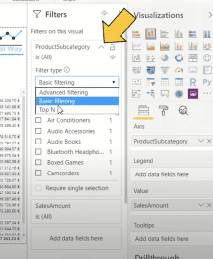
Filters Pane allows you to filter the data in visualizations. Filters are available in three levels – on selected visual/visuals, on selected page, or on all pages. Power BI offers us three types of filtering – Basic Filtering, Advanced Filtering and Top N. For example, Imagine you want to display only top 3 countries depending on (the field) Profit, you can do that using the Power BI filter.
Enable filters pane in settings if it is not shown:
- go to file
- click on options and settings
- click on options
- click on report settings
- make sure the “enable the updated filter pane” is selected and press okay
Only page filters and report filters are shown on the filters pane – for a visualization filter we need to select a visual or add a new visual to see it.
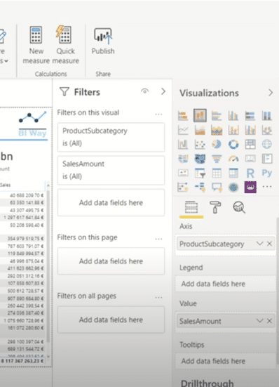
For filters on a visual choose the data you want to filter by clicking on it and select the filters by ticking the boxes next to them as shown on the screenshot below. Also select the type of filtering you want as shown on the second screenshot below.
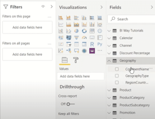
For page and report filtering drag the data on the filters pane.
Ready to get started?
Get in touch!

